Welcome to the Polished Habitat Decorating Method series! Today we’re going over the second step of decorating – finding our style direction for the room!
If you haven’t read Step 1 yet, you need to go back and start there. Without that piece, this step won’t be nearly as impactful.
And if you’ve already read it and completed your worksheet, now might be a good time to look over the worksheet to have your answers in mind as you read this post. In fact, let’s use my worksheet from step 1 as an example as we move forward!
Step 2 is finding a style direction that makes you feel most of the words from your worksheet.
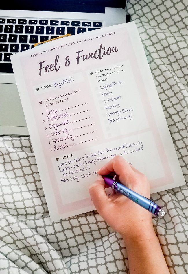
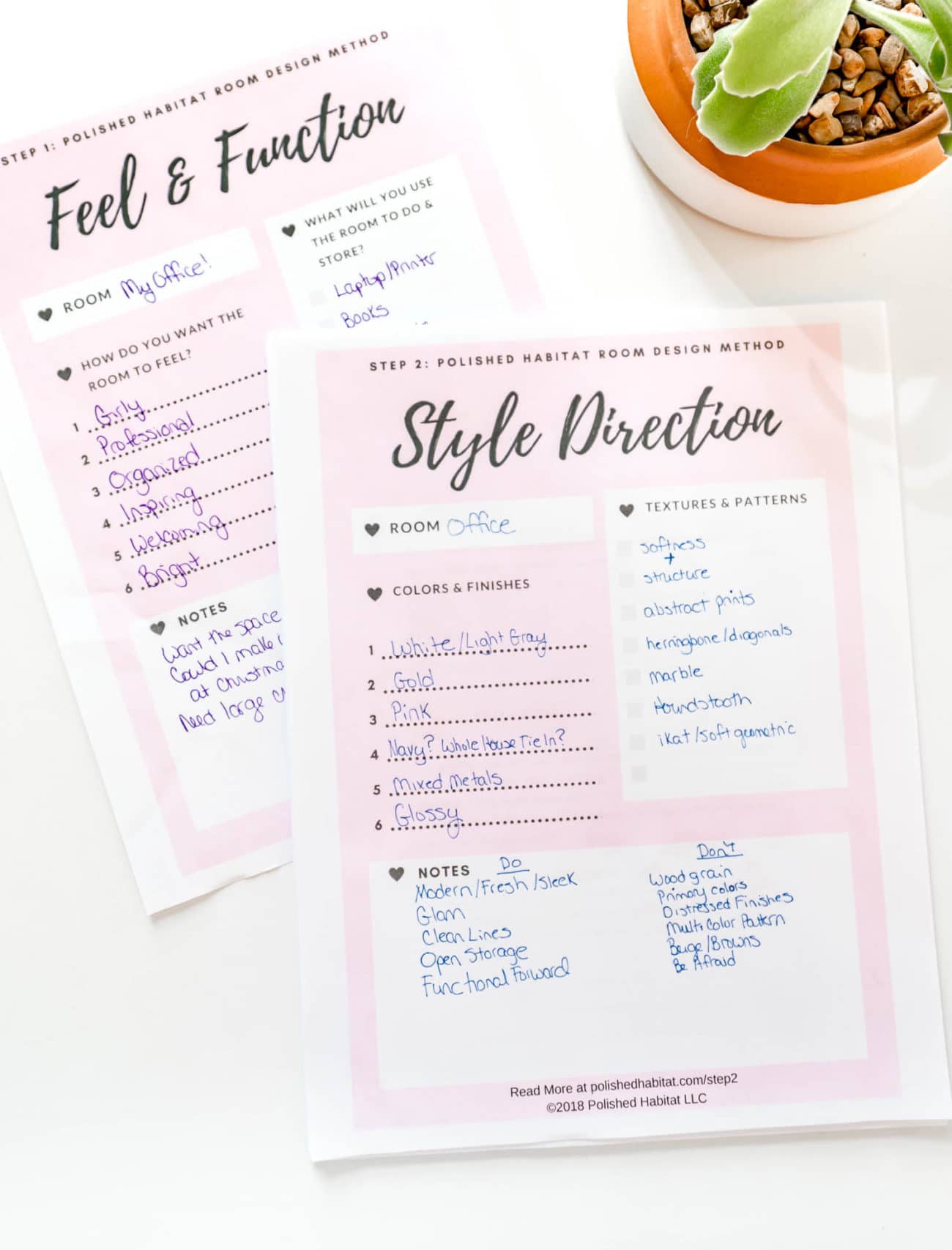
My office feeling words were:
Girly
Professional
Organized
Inspiring
Welcoming
Bright
Our prior office was cool, but not at all girly/feminine and I knew THAT feeling was the one I really craved.
Next up, I needed to figure out what kinds of colors, styles, and patterns actually made me feel those words.
I created a second worksheet to capture them for you, just fill out the box below and you’ll get the worksheet to your email fairly quickly. It works for both new and existing subscribers!
This is where your personal style really comes into play. For me, “girly” means blush pink and white, but for you it could be aqua, bold purple or soft yellow.
Take some time to consider what colors embody the words on your feeling list TO YOU and jot them down. Don’t worry about whether they work together at this point, we’re just brainstorming.
In the same section, also note different wood and metal finishes that speak to you.
Here’s a list of things to consider beyond colors, but don’t limit yourself to these!
Brushed Gold
Chrome
Satin Nickel
Oil Rubbed Bronze
Light, Medium, Dark Stains
Minimal Grained Wood vs Lots of Grain
Lacquer-Painted Wood (White, Black, Any Colors)
Distressed Finishes
In addition to colors and finishes, we also need to think about the textures/patterns and styles we’re drawn to for the room, both in general and based on the feeling list.
I thought of examples for you in this category as well, but again, don’t limit yourself to these.
Florals
Stripes
Herringbone
Marble
Leather
Buffalo Check
Abstract
Realism
Graphic
Photography
Farmhouse
Boho
Glam
Industrial
Traditional
Modern
Scandinavian
Mid-Century
Vintage
Rustic
Minimalism
French Country
Coastal
Clean lines
Fine Details (ornate carved furniture legs, etc)
Art Deco
If you need more help with this brainstorming step, I found this post that has 30 different types of fabric prints. It’s a great resource to scroll through and see what catches your eye. And this one has tons of design styles.
I wouldn’t obsess over the details of any of the photos in those posts at this point. Instead, scroll quickly and see what you’re drawn to for your space and either note the design style or anything specific you notice (ie: black & white stripes).
Just like the color list, try not to worry about having contradictions on your list. While some seemingly opposite styles work better together than others, we’re starting with the wider range of options until we narrow down to one inspiration piece in step 3.
You also don’t need to worry about not knowing the right word for something. Just describe it the best you can!
Since we all know I’m extra wordy, I added a notes section to the worksheet and used it for some do’s and don’ts that crossed my mind for the room, but didn’t necessarily fit in the other categories.
Here’s a couple other tips as you work through the Style Direction step.
- Don’t worry about finishing the worksheet in one session. It looks very basic, but that doesn’t mean it’s super fast. Design is more of an evolution vs something that happens all at once. Walk away when you feel like there may be more, but it’s not coming to you. The next day, read your Feel & Function worksheet again, followed by your “so far” Style Direction worksheet and see if you have any new thoughts.
- If you’re really stuck for words, now is a great time to start looking through magazines, Houzz, open houses, favorite stores, etc. You aren’t looking for exact pieces for your space yet, but I bet you’ll notice some patterns of what you’re drawn to. Note those words down because we’re going to need them on the next step! Don’t worry about whether what you’re drawn to is “in style”, write down what you love.
- Make sure you’re keeping one individual room in mind per sheet to reduce overwhelm. For example, in some rooms, I love warm wood, leather, and industrial accents. But for the office, I was going for a fully feminine feel, so I didn’t need to include any of those things. You’ll definitely have overlap between spaces (I love each room to some kind of fresh, modern feel and try to repeat a bit of navy, white, and pink), but things get overwhelming fast if you don’t stay focused.
- You CAN have sheets for multiple rooms going at once. If you’re working on a bathroom and keep thinking of words for your bedroom, go ahead and start a bedroom sheet too.
- Consider picking up a pretty binder and making a section for each room in your home.
Next up in the series, I’ll show you how I narrow down ALL THE WORDS I’ve made you think of so far into one inspiration piece that will guide the rest of the steps.
After that, we’ll be talking fun things like floor plans, budgeting, shopping, and giving our rooms that polished feel we crave.
If you haven’t done it yet, scroll back up to fill in the email box. You’ll get the worksheet, plus get on the list to be notified when future steps are published. Win-win!
Step 3 is all about a foolproof way to find the perfect color palette. See it here!
For some extra motivation, check out this page full of my before, in progress, and after photos from around our house. You’ll see a trend of spaces that ranged from okay to bad slowly evolving into a home we love.

Leave a Reply