Welcome to week #2 of our master bedroom makeover! If it’s your first time visiting, or you missed what I’m up too, you can get all caught up with the before photos and my plans in the week #1 post. The short version is that I’m playing along with a group event called the One Room Challenge, and I’ve got 4 weeks left to totally transform my master bedroom. Yikes!
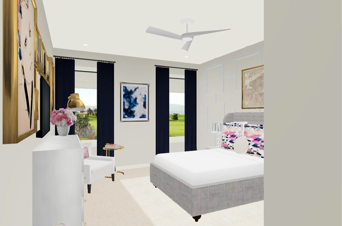
Here’s a reminder of the direction we’re headed in the room.
This weekend was all about picking a wall paint AND getting the space painted. The thing I love about the One Room Challenge is that you have to make decisions to keep moving forward. Sadly, that doesn’t mean it’s easy to choose.
I thought I was going to do a light to medium gray, but I just couldn’t get an exact image in my mind for what I wanted. Warm gray, cool gray, I had no idea!
Thank goodness for paint samples. I made a list of colors I wanted to try, then left it at home when I went to Lowes. Fail! I did have my grocery list from the week before and tried to hand it to the paint guy. It didn’t work.
So, I winged it and picked 6 colors to test out. After getting them on the wall, I had a better idea of what was looking good, but nothing was quite perfect. A quick trip back to Lowe’s and I had 4 more samples. Here’s what it looked like with all colors on the wall.
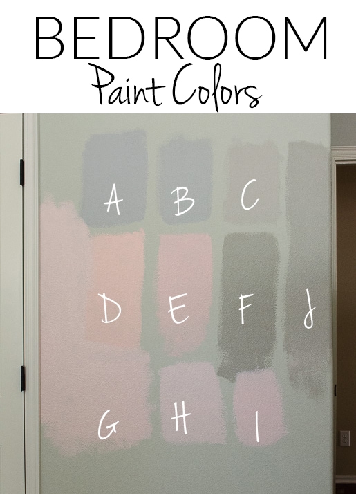
Here’s the legend in case you see something you like!
A: Valspar Gravity
B: Sherwin-Williams SW1476 Gray Sanctuary
C: Sherwin-Williams SW7015 Repose Gray
D: Valspar Baby Blush
E: Sherwin-Williams SW2037 Mad About Pink
F: Sherwin-Williams SW3476 Mindful Gray
G: Sherwin-Williams SW6581 Verbena
H: Sherwin-Williams SW6567 Anemone
I: Sherwin-Williams SW6588 Diminutive Pink
J: Sherwin-Williams SW3476 Mindful Gray custom mixed at 75%
As you probably noticed, I got a wild craving to paint the room pink! The Baby Blush and Mad About Pink were a bit too dark, so three of the four colors I went back for were softer pink options. So intriguing, right!?!
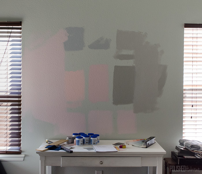
When painting samples, we’ve learned the hard way in the past that it’s really important to test them on different walls. Each area of a room gets different light, and it’s amazing how different the same color can look like on each wall.
Here’s the same 10 samples between the windows.
And here is the same 10 on the wall next to the windows.
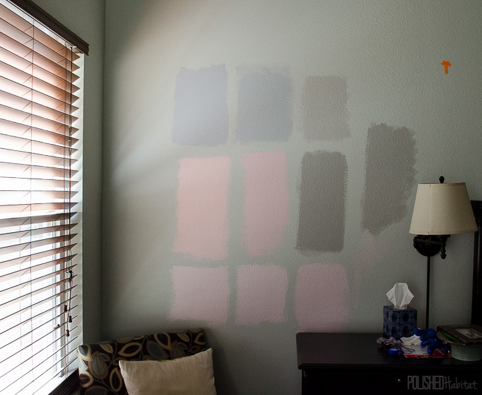
After looking at each set of colors on the wall throughout the day, I landed on two favorites. Verbena (the one from the lower left corner) and Repose Gray (upper right) both had some serious potential!
So what do you think? Should I go pink? Even though we may already have picked and be painting, I still can’t wait to hear your thoughts!
I’m off in Salt Lake City for a conference through Sunday, but I’m dreaming of all the things I get to work on in the bedroom when I get home. The new bed arrived and I peeked in the box before I left. So exciting!
Now that you’ve seen what I’ve been up to, make sure you check out the rest of the One Room Challenge participants at Calling It Home!

Jennifer Griffin says
You walls look like mine did when we painted our Master… I’m sure we had no less that 15 samples up! Grays are SO hard… I like what you’ve narrowed it down to. Have fun at your conference!
Vicki and Jennifer Fenton says
Melissa – we love your paint “board”. This is how we choose paint color too. We are leaning towards Verbena but we know no matter which you choose, it will be beautiful! We love following along. Being that this is our first ORC we have already learned a lot – mostly what “not to do” for next time! Have fun at the conference!
Melissa George says
Oh yeah, the “what NOT to do” learning happens to all of us!!!
Krystle Pickens says
Oooohhh!!! I hope you chose the pink!! I have spent a lot of time lately talking about incorporating pink into a room… it’s not happening in my tiny condo, but maybe my next house, and hopefully your room!!! Can’t wait to see!
Good luck on your progress for this week! I’m so behind already!
Melissa George says
Oh don’t worry, I’ve been in Salt Lake City since Wednesday and won’t get home until Sunday at almost midnight so I’m right with you feeling behind! You just might be getting your wish to see a pink room though 🙂
Erin says
Hmmm, my vote is for the gray color. I think it would be more fun to bring in pink accents in the room than go with all the walls being pink. Good luck with the final decision!
D'Lynn says
I’m curious as to how you will incorporate the pink? I am liking the gray. I like the repose, but I really am digging the mindful gray at 75%. But, I’m sure you are going to make the room look fab whatever colors you choose.
One quick question, I’ve been dying to ask… What does the graphic on the garage wall say?
Thanks. And Happy Makeover
Kristin @ Postbox Designs says
I literally just picked the color “Mindful Gray” for a client this week-what are the odds?! So I’m voting for that one, but I think they are all lovely! Looking forward to seeing your final selection!
Melissa George says
I LOVE the mindful gray, but I’m doing dark dramatic curtains and lots of moody art, so I needed some balance. I’m sure I’ll find somewhere else is in the house to use the Mindful though!
Wanda @ From House To Home says
I love both of those colors! I think either of them would look great in your room…can’t wait to see which one you chose!
Denise says
I vote Repose Grey, but I’m sure whatever you choose will be fabulous!
Evelyn B says
Looks like gray is the favored – how about doing the walls gray but going with the pink behind the bed? Like an accent wall. That way you could have both! Will be interesting to see what you choose. Pick what you like but be sure hubby does too! Love ya,
Erin @ Lemons, Lavender, & Laundry says
I am definitely one that would go with a gray over pink, only because I love a neutral with pops of color. Hope you’re enjoying your conference!
Jessica says
I really like colors C and G. One grey and one pink. I typically like muted pinks and I think whichever color you go with will look great…You are a wonderful designer and you have your past ORC’s to prove it.